如何对基因型和环境的互作做一个简单的统计推断
在对实验突变体和野生型数据进行表型统计的时候,我们常常会做这样一个图:
library(ggplot2)
library(dplyr)
# LD是长日照,SD是短日照
# WT是野生型,mutant是突变体
# 数字代表了开花时间
LD_WT <- c(10L, 10L, 10L, 10L, 11L, 11L, 11L, 11L, 11L, 11L, 11L, 11L, 12L, 12L, 12L, 12L, 12L, 12L, 12L, 13L, 13L, 13L, 14L, 14L)
SD_WT <- c(14L, 14L, 15L, 15L, 15L, 16L, 16L, 16L, 16L, 16L, 16L, 16L, 16L, 16L, 17L, 17L, 17L, 17L, 17L, 18L, 19L)
LD_mutant <- c(18L, 19L, 19L, 19L, 20L, 20L, 20L, 20L, 20L, 21L, 21L, 21L, 21L, 21L, 22L, 22L, 22L, 22L, 23L, 23L, 23L, 24L, 24L, 24L)
SD_mutant <- c(36L, 36L, 38L, 40L, 40L, 44L, 44L, 45L, 45L, 45L, 47L, 47L)tibble(
type = rep(c("LD_mutant", "LD_WT", "SD_mutant", "SD_WT"),
c(24, 24, 12, 21)),
flower_time = c(LD_mutant, LD_WT, SD_mutant, SD_WT)
) %>%
tidyr::separate(col = "type",
into = c("environment", "genotype"),
sep = "_") %>%
mutate(environment = factor(environment, levels = c("SD", "LD")),
genotype = factor(genotype, levels = c("WT", "mutant")))-> data
str(data)
## tibble [81 x 3] (S3: tbl_df/tbl/data.frame)
## $ environment: Factor w/ 2 levels "SD","LD": 2 2 2 2 2 2 2 2 2 2 ...
## $ genotype : Factor w/ 2 levels "WT","mutant": 2 2 2 2 2 2 2 2 2 2 ...
## $ flower_time: int [1:81] 18 19 19 19 20 20 20 20 20 21 ...
data_summary <- data %>%
group_by(environment, genotype) %>%
summarise(flower_time = mean(flower_time))
## `summarise()` has grouped output by 'environment'. You can override using the `.groups` argument.
data_summary
## # A tibble: 4 x 3
## # Groups: environment [2]
## environment genotype flower_time
## <fct> <fct> <dbl>
## 1 SD WT 16.1
## 2 SD mutant 42.2
## 3 LD WT 11.6
## 4 LD mutant 21.2ggplot(data, aes(x = environment, y = flower_time, color = genotype)) +
# stat_summary(fun = mean, position = position_dodge(width = 0.6),
# geom="bar", fill = "white", width = 0.5) +
geom_col(data = data_summary,
position = position_dodge(width = 0.6),
width = 0.5, fill = "white") +
ggbeeswarm::geom_beeswarm(dodge.width = 0.6) +
annotate("rect", xmin = 0.9, xmax = 1.1,
ymin = 27, ymax = 27, colour = "black") +
annotate("rect", xmin = 1.9, xmax = 2.1,
ymin = 48, ymax = 48, colour = "black") +
ylim(0, 50) +
theme_bw() -> p
p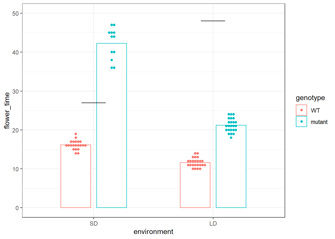
然后我们会在黑线的地方加上p-value值,来分别代表在LD和SD的情况下,突变体和野生型的差异。
但是最近有人突然问我是不是能在红线的地方加个p-value,来代表针对开花时间这个表型,基因A是会跟光照长短有关系的,或者说针对开花时间这个表型,基因A和环境光照因素是会有互作的。并给出了能够表征Genotype x Environment的诸如AMMI等模型供我参考。
p +
    annotate("rect", xmin = 0.9, xmax = 2.1,
           ymin = 50, ymax = 50, colour = "red")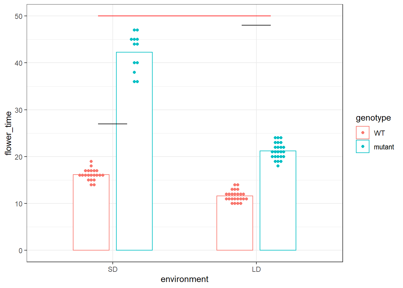
作为一个没有学过群体遗传学的人来说,这些模型对我来说简直是天书一般的存在,自然也给不出一个p-value。但对于一个略微学过一些线性回归的人来说,我觉得这个问题似乎可以用简单的互作项来解决。所以我写了这篇文章,一来是为那些同样有这个需求的人做参考,二来也是想要看看大家的意见,看这个想法是不是合理。
不过为了大家更好地理解针对这种情况下的互作项,首先我们需要先通过一些例子来理解一些基本的原理,然后我再给出解决的模型。
因子型变量和互作项
首先我们通过一个例子来了解下因子型预测变量和互作项。这里用到的一个网上的训练数据集1。首先我们需要下载和修改下这个数据
# read data frame from the web
autompg = read.table(
  "http://archive.ics.uci.edu/ml/machine-learning-databases/auto-mpg/auto-mpg.data",
  quote = "\"",
  comment.char = "",
  stringsAsFactors = FALSE)
# give the dataframe headers
colnames(autompg) = c("mpg", "cyl", "disp", "hp", "wt", "acc", "year", "origin", "name")
# remove missing data, which is stored as "?"
autompg = subset(autompg, autompg$hp != "?")
# remove the plymouth reliant, as it causes some issues
autompg = subset(autompg, autompg$name != "plymouth reliant")
# give the dataset row names, based on the engine, year and name
rownames(autompg) = paste(autompg$cyl, "cylinder", autompg$year, autompg$name)
# remove the variable for name
autompg = subset(autompg, select = c("mpg", "cyl", "disp", "hp", "wt", "acc", "year", "origin"))
# change horsepower from character to numeric
autompg$hp = as.numeric(autompg$hp)
# create a dummy variable for foreign vs domestic cars. domestic = 1.
autompg$domestic = as.numeric(autompg$origin == 1)
# remove 3 and 5 cylinder cars (which are very rare.)
autompg = autompg[autompg$cyl != 5,]
autompg = autompg[autompg$cyl != 3,]
# the following line would verify the remaining cylinder possibilities are 4, 6, 8
#unique(autompg$cyl)
# change cyl to a factor variable
autompg$cyl = as.factor(autompg$cyl)
这里面mpg是车辆油耗,cyl是气缸数目,disp是发动机排量,hp是马力数,domestic代表的是美国车还是其他地方的车。还有其他列我就不一一介绍了。
head(autompg)
##                                         mpg cyl disp  hp   wt  acc year origin
## 8 cylinder 70 chevrolet chevelle malibu  18   8  307 130 3504 12.0   70      1
## 8 cylinder 70 buick skylark 320          15   8  350 165 3693 11.5   70      1
## 8 cylinder 70 plymouth satellite         18   8  318 150 3436 11.0   70      1
## 8 cylinder 70 amc rebel sst              16   8  304 150 3433 12.0   70      1
## 8 cylinder 70 ford torino                17   8  302 140 3449 10.5   70      1
## 8 cylinder 70 ford galaxie 500           15   8  429 198 4341 10.0   70      1
##                                         domestic
## 8 cylinder 70 chevrolet chevelle malibu        1
## 8 cylinder 70 buick skylark 320                1
## 8 cylinder 70 plymouth satellite               1
## 8 cylinder 70 amc rebel sst                    1
## 8 cylinder 70 ford torino                      1
## 8 cylinder 70 ford galaxie 500                 1

str(autompg)
## 'data.frame':    383 obs. of  9 variables:
##  $ mpg     : num  18 15 18 16 17 15 14 14 14 15 ...
##  $ cyl     : Factor w/ 3 levels "4","6","8": 3 3 3 3 3 3 3 3 3 3 ...
##  $ disp    : num  307 350 318 304 302 429 454 440 455 390 ...
##  $ hp      : num  130 165 150 150 140 198 220 215 225 190 ...
##  $ wt      : num  3504 3693 3436 3433 3449 ...
##  $ acc     : num  12 11.5 11 12 10.5 10 9 8.5 10 8.5 ...
##  $ year    : int  70 70 70 70 70 70 70 70 70 70 ...
##  $ origin  : int  1 1 1 1 1 1 1 1 1 1 ...
## $ domestic: num 1 1 1 1 1 1 1 1 1 1 ...首先我们可以做一个简单的一元线性回归,探究的是mpg和hp的关系。
\[
Y = \beta_0 + \beta_1 x_1 + \epsilon,
\]
这里Y代表了mpg,而\(x_1\)代表的是hp。而\(\beta_0\)代表的是当hp等于0的时候,mpg的估计平均值,而\(\beta_1\)代表的是当hp增加1的时候,mpg所增加的平均数值。在进行线性回归之前,我们可以做一个简单的图形展示:画出两者的散点图。
autompg %>%
  ggplot(aes(x = hp, y = mpg)) +
  geom_point() -> p

p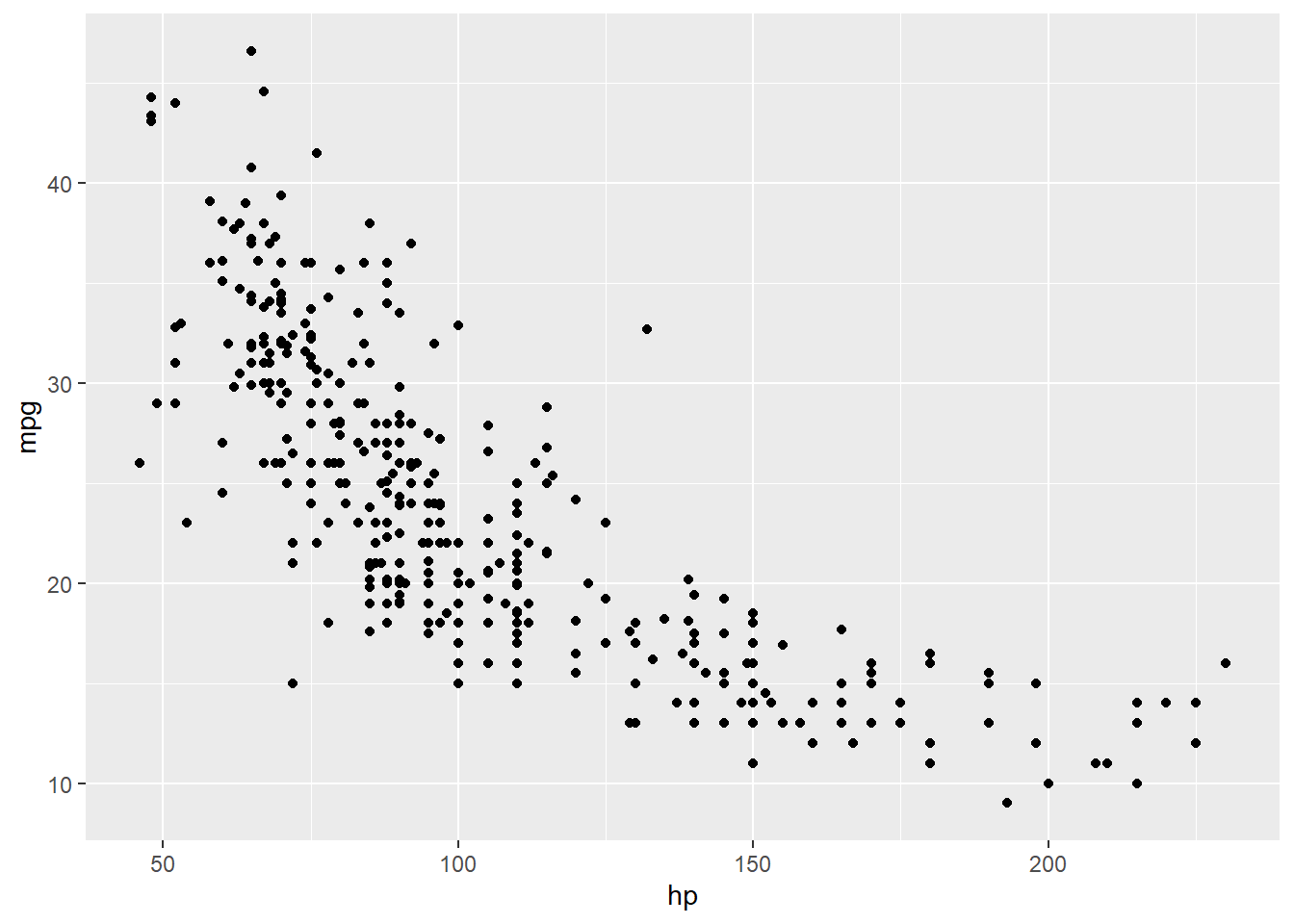
根据散点图,我们可以看到,两者大致呈现的是负相关的关系,随着hp的增加,mpg呈现下降趋势。然后我们开始做一个线性回归。
lm_mh <- lm(mpg ~ hp, data = autompg)

summary(lm_mh)
##
## Call:
## lm(formula = mpg ~ hp, data = autompg)
##
## Residuals:
##      Min       1Q   Median       3Q      Max
## -13.5897  -3.2939  -0.3661   2.7467  16.9068
##
## Coefficients:
##             Estimate Std. Error t value Pr(>|t|)
## (Intercept) 39.93969    0.72416   55.15   <2e-16 ***
## hp          -0.15764    0.00648  -24.33   <2e-16 ***
## ---
## Signif. codes:  0 '***' 0.001 '**' 0.01 '*' 0.05 '.' 0.1 ' ' 1
##
## Residual standard error: 4.918 on 381 degrees of freedom
## Multiple R-squared:  0.6083, Adjusted R-squared:  0.6073
## F-statistic: 591.7 on 1 and 381 DF,  p-value: < 2.2e-16

lm_mh_coef <- coefficients(lm_mh)可以看到,两者的对应关系为:\(Y = 39.9396881 + -0.1576383x_1 + \epsilon\)
p +
  geom_abline(slope = lm_mh_coef[2],
              intercept = lm_mh_coef[1]) -> p

p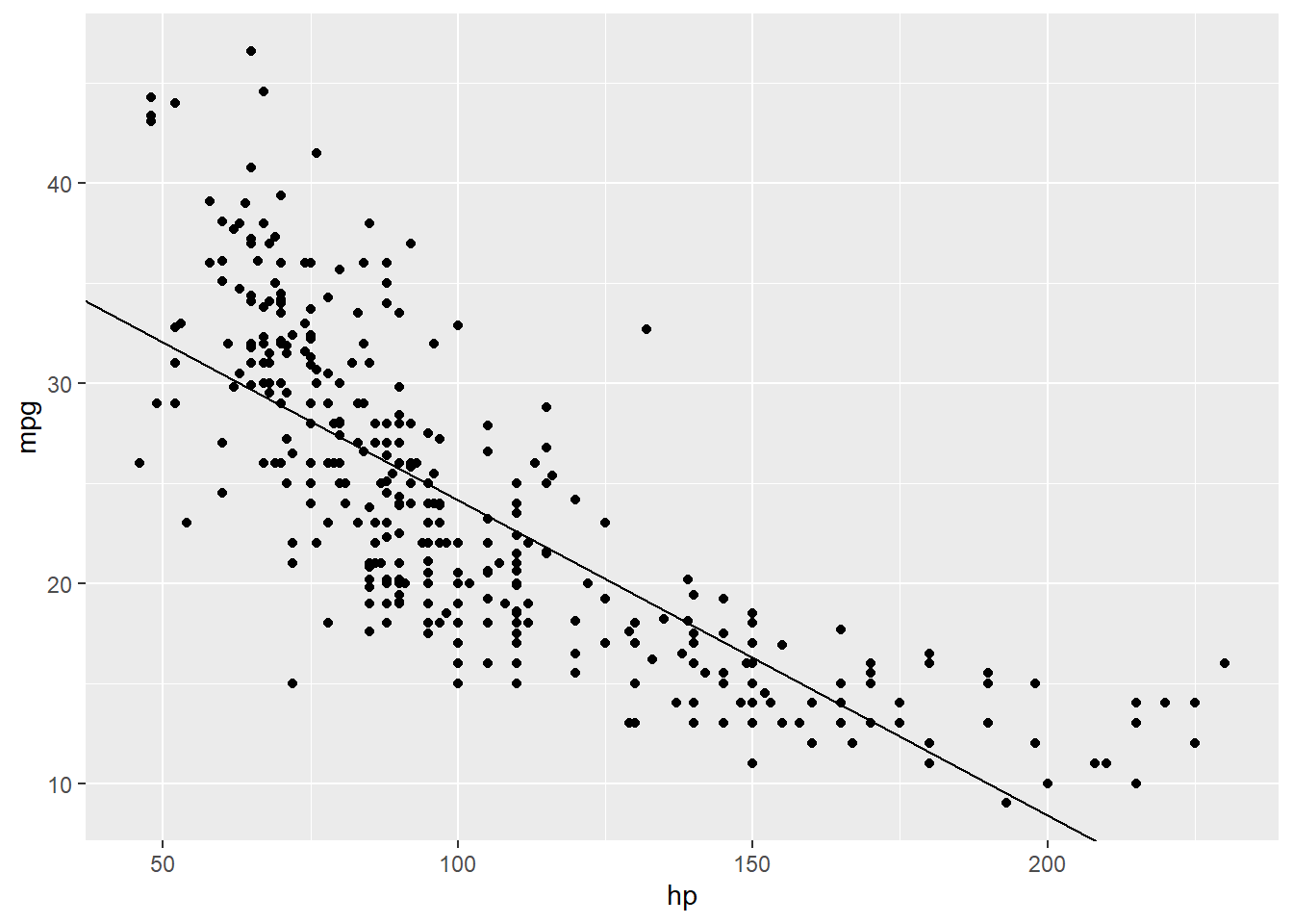
但如果我们给图中的点根据是否是美国车来添加颜色的话,就会发现这根回归线似乎拟合的不太准确。看起来红点大部分在线的上面,而蓝点似乎大部分在线的下面,这意味着我们需要重新地拟合曲线。
# 因为domestic只有两种类型,即美国车和其余地方车,其实际上是一个分类变量
# 为了更方便地展示,我们重新对原来的0/1进行修改
# 用UN来代表美国,用Others代表其他,并将其设置因子类型

autompg %>%
  mutate(domestic = case_when(
    domestic == 1 ~ "UN",
    TRUE ~ "Others")) %>%
  mutate(domestic = factor(domestic, levels = c("Others", "UN"))) %>%
  select(mpg, hp, domestic) -> autompg_select

str(autompg_select)
## 'data.frame':    383 obs. of  3 variables:
##  $ mpg     : num  18 15 18 16 17 15 14 14 14 15 ...
##  $ hp      : num  130 165 150 150 140 198 220 215 225 190 ...
##  $ domestic: Factor w/ 2 levels "Others","UN": 2 2 2 2 2 2 2 2 2 2 ...

autompg_select %>%
  ggplot(aes(x = hp, y = mpg)) +
  geom_point(aes(color = domestic)) +
  scale_color_manual(values = c("UN" = "blue",
                                "Others" = "red")) +
  geom_abline(slope = lm_mh_coef[2],
              intercept = lm_mh_coef[1]) -> p
p
这就需要我们考虑额外施加另一个变量:domestic,那么方程也就变成了
\[ Y = \beta_0 + \beta_1 x_1 + \beta_2 x_2 + \epsilon, \]
这里的\(x_1\) and \(Y\) 仍旧是相同的意思,但\(x_2\)却变成了一个分类变量。
\[ x_2 = \begin{cases} 1 & \text{UN} \\ 0 & \text{Others} \end{cases} \]
在一些教材中,这个分类变量也被称之为哑变量(dummy variable)或者示性变量(indicator variable),其标识了\(x_2\)是美国车还是其他地方车。那么现在我们的线性回归模型就变成了
lm_mhd <- lm(mpg ~ hp + domestic, data = autompg_select)

summary(lm_mhd)
##
## Call:
## lm(formula = mpg ~ hp + domestic, data = autompg_select)
##
## Residuals:
##      Min       1Q   Median       3Q      Max
## -11.2022  -3.3704  -0.5117   2.6312  15.2621
##
## Coefficients:
##              Estimate Std. Error t value Pr(>|t|)
## (Intercept) 39.905208   0.676599  58.979  < 2e-16 ***
## hp          -0.131804   0.006962 -18.931  < 2e-16 ***
## domesticUN  -4.213084   0.560636  -7.515 4.13e-13 ***
## ---
## Signif. codes:  0 '***' 0.001 '**' 0.01 '*' 0.05 '.' 0.1 ' ' 1
##
## Residual standard error: 4.595 on 380 degrees of freedom
## Multiple R-squared:  0.659,  Adjusted R-squared:  0.6572
## F-statistic: 367.2 on 2 and 380 DF,  p-value: < 2.2e-16

(lm_mhd_coef <- coefficients(lm_mhd))
## (Intercept)          hp  domesticUN
##  39.9052076  -0.1318041  -4.2130841
将系数带回到公式,就变成了 \(Y = 39.9052076 + -0.1318041x_1 + -4.2130841x_2 + \epsilon\)。我们可以将这个公式拆成两个子公式来看,当\(x_2\)是UN的时候,其代表了1,公式就变成了\(Y = 39.9052076 + -4.2130841 + -0.1318041x_1 + \epsilon\)。而当\(x_2\)是Others的时候,其代表了0,公式就变成了\(Y = 39.9052076 + -0.1318041x_1 + \epsilon\)。可以看到,两个子公式相差的是一个截距项。
我们也可以重新在图上加上这两个子公式对应的回归线。通过再添加一个变量,我们发现我们的回归模型就拟合的比较好了。
autompg_select %>%
  ggplot(aes(x = hp, y = mpg)) +
  geom_point(aes(color = domestic)) +
  scale_color_manual(values = c("UN" = "blue",
                                "Others" = "red")) +
    geom_abline(slope = lm_mhd_coef[2],
              intercept = lm_mhd_coef[1] + lm_mhd_coef[3],
              color = "blue") +
  geom_abline(slope = lm_mhd_coef[2],
              intercept = lm_mhd_coef[1],
color = "red") 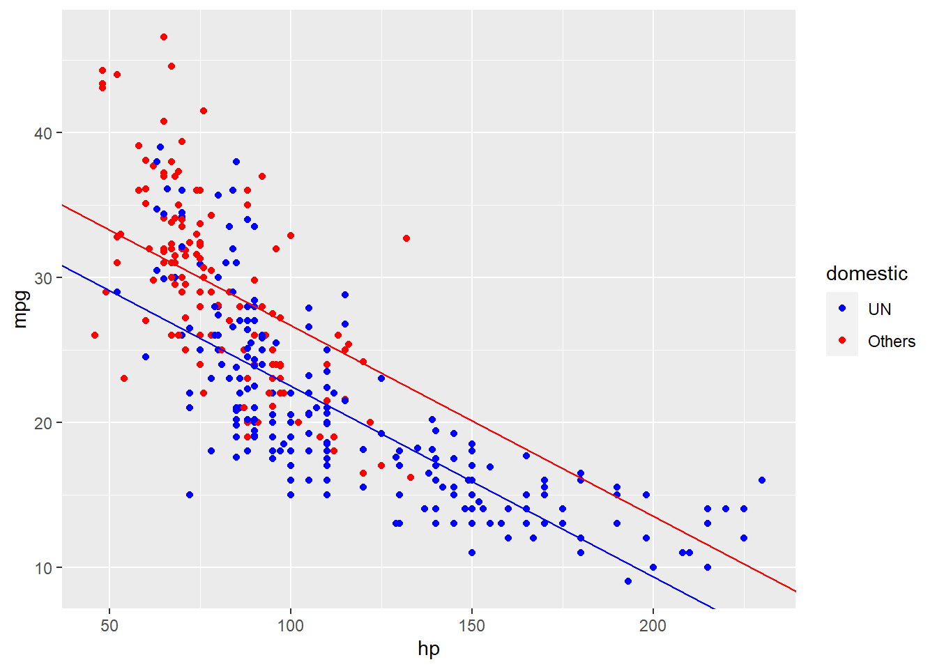
看起来比单纯地根据一个变量去拟合要好得多,但眼尖的人可能会发现,似乎红色这根线还应该更陡峭一点。换而言之,每增加1个单位的hp所对应增加的mpg值,在UN和Others两种车之中是不一样的。所以我们需要将hp和domestic的互作考虑在内,即考虑所谓的互作项。对应的公式是:
\[ Y = \beta_0 + \beta_1 x_1 + \beta_2 x_2 + \beta_3 x_1 x_2 + \epsilon, \]
当domestic是UN,即\(x_2\)是1的时候,公式为
\[ Y = (\beta_0 + \beta_2) + (\beta_1 + \beta_3) x_1 + \epsilon. \]
当domestic是Others,即\(x_2\)是0的时候,公式为:
\[ Y = \beta_0 + \beta_1 x_1 + \epsilon. \]
可以看到,这两个拆分出来的公式,截距不同,斜率也不同了。我们再次用R语言去拟合回归曲线,只不过这一次考虑到了互作项:
lm_mhd_int <- lm(mpg ~ hp * domestic, data = autompg_select)

summary(lm_mhd_int)
##
## Call:
## lm(formula = mpg ~ hp * domestic, data = autompg_select)
##
## Residuals:
##     Min      1Q  Median      3Q     Max
## -12.032  -3.075  -0.617   2.398  14.792
##
## Coefficients:
##                Estimate Std. Error t value Pr(>|t|)
## (Intercept)    46.88684    1.64345  28.530  < 2e-16 ***
## hp             -0.21954    0.02010 -10.924  < 2e-16 ***
## domesticUN    -12.54014    1.87684  -6.682 8.46e-11 ***
## hp:domesticUN   0.09901    0.02135   4.637 4.86e-06 ***
## ---
## Signif. codes:  0 '***' 0.001 '**' 0.01 '*' 0.05 '.' 0.1 ' ' 1
##
## Residual standard error: 4.476 on 379 degrees of freedom
## Multiple R-squared:  0.6773, Adjusted R-squared:  0.6748
## F-statistic: 265.2 on 3 and 379 DF,  p-value: < 2.2e-16

(lm_mhd_int_coef <- coefficients(lm_mhd_int))
##   (Intercept)            hp    domesticUN hp:domesticUN
##   46.88684204   -0.21953666  -12.54014246    0.09900671
将系数带回到公式,就变成了
\[ Y = 46.886842 + -0.2195367x_1 + -12.5401425x_2 + 0.0990067 x_1 x_2 + \epsilon \]
我们同样可以将这个公式拆成两个子公式来看,当\(x_2\)是UN的时候,其代表了1,公式就变成了
\[ Y = (46.886842 + -12.5401425) + (-0.2195367 + 0.0990067) x_1 + \epsilon \]
而当\(x_2\)是Others的时候,其代表了0,公式就变成了
\[ Y = 46.886842 + -0.2195367x_1 + \epsilon \]
我们可以把这两条回归线画到图像上去。可以看到,通过在多元线性回归中加入了互作项,我们的回归线看起来更加地合理了。
autompg_select %>%
  ggplot(aes(x = hp, y = mpg)) +
  geom_point(aes(color = domestic)) +
  scale_color_manual(values = c("UN" = "blue",
                                "Others" = "red")) +
  geom_abline(slope = lm_mhd_int_coef[2] + lm_mhd_int_coef[4],
              intercept = lm_mhd_int_coef[1] + lm_mhd_int_coef[3],
              color = "blue") +
  geom_abline(slope = lm_mhd_int_coef[2],
              intercept = lm_mhd_int_coef[1],
color = "red") 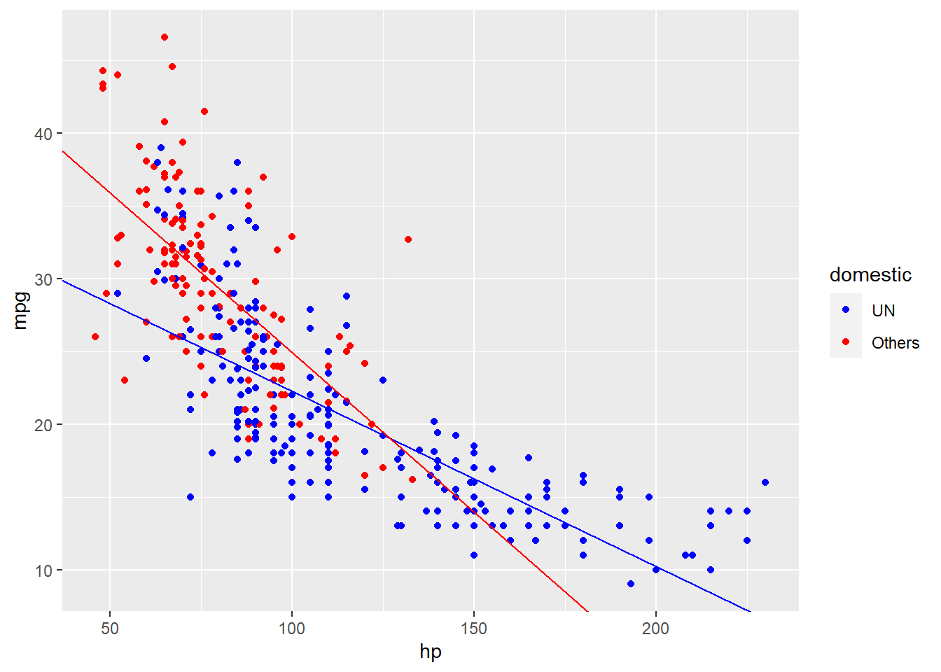
常见统计检验的本质都是线性模型
其实大部分常见的统计模型(t 检验、相关性检验、方差分析(ANOVA)、卡方检验等) 是线性模型的特殊情况或者是非常好的近似2。这里我用前面的开花表型数据来说明我们常用的两样本t-test是如何变成线性回归模型的。
# 我们再次展示下我们的数据及summary
data
## # A tibble: 81 x 3
##    environment genotype flower_time
##    <fct>       <fct>          <int>
##  1 LD          mutant            18
##  2 LD          mutant            19
##  3 LD          mutant            19
##  4 LD          mutant            19
##  5 LD          mutant            20
##  6 LD          mutant            20
##  7 LD          mutant            20
##  8 LD          mutant            20
##  9 LD          mutant            20
## 10 LD          mutant            21
## # ... with 71 more rows

data_summary
## # A tibble: 4 x 3
## # Groups:   environment [2]
##   environment genotype flower_time
##   <fct>       <fct>          <dbl>
## 1 SD          WT              16.1
## 2 SD          mutant          42.2
## 3 LD          WT              11.6
## 4 LD          mutant          21.2
首先我们对LD情况下的mutant和WT做一个图像展示和对应的t-test检验
data %>%
  filter(environment == "LD") %>%
  ggplot(aes(x = genotype, y = flower_time)) +
  ggbeeswarm::geom_beeswarm() +
  geom_point(color = "red", size = 5, data = filter(data_summary,
                                                    environment == "LD"))-> p

p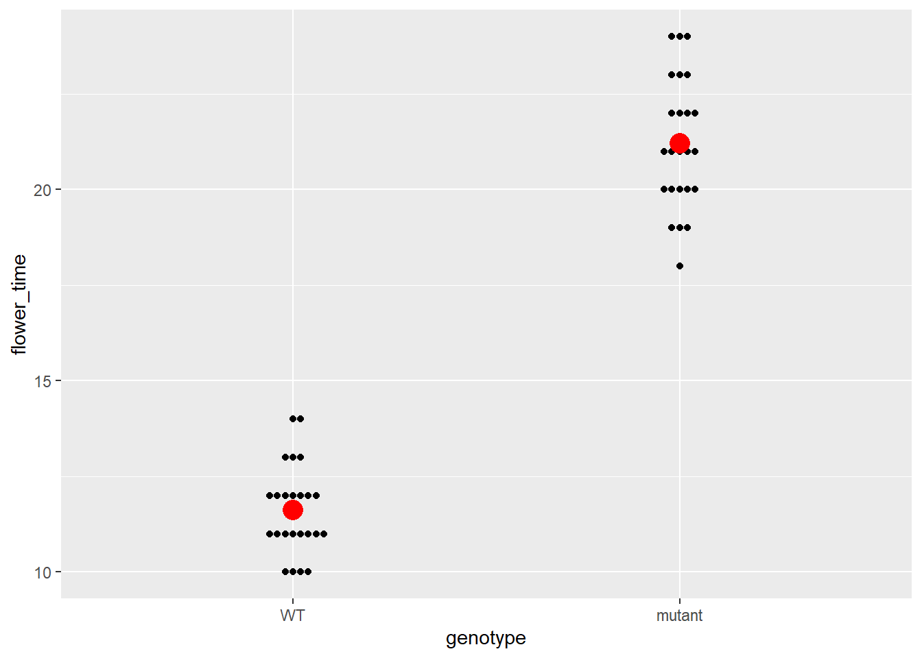
Ttest_result <- t.test(LD_mutant, LD_WT)

# 这里的mean of x和mean of y分别对应着data_summary里面LD mutant和LD_WT的值
Ttest_result
##
##  Welch Two Sample t-test
##
## data:  LD_mutant and LD_WT
## t = 22.563, df = 40.596, p-value < 2.2e-16
## alternative hypothesis: true difference in means is not equal to 0
## 95 percent confidence interval:
##   8.725293 10.441374
## sample estimates:
## mean of x mean of y
##  21.20833  11.62500

data_summary %>%
  filter(environment == "LD")
## # A tibble: 2 x 3
## # Groups:   environment [1]
##   environment genotype flower_time
##   <fct>       <fct>          <dbl>
## 1 LD          WT              11.6
## 2 LD          mutant          21.2

# 那么true difference in means就是
Ttest_result$estimate[1] - Ttest_result$estimate[2]
## mean of x
##  9.583333

# 或者是置信区间中间的那个值
mean(Ttest_result$conf.int)
## [1] 9.583333
然后让我们来建立一个回归模型:
\[ Y = \beta_0 + \beta_1 x_1 + \epsilon, \]
这里的\(Y\)代表了开花的时间,\(x_1\)跟前面一样,是一个示性变量。我这里先不说\(\beta_0\)代表了什么,后面大家就知道了。
\[ x_1 = \begin{cases} 1 & \text{mutant} \\ 0 & \text{WT} \end{cases} \]
然后我们开始跟前面一样拟合回归线
lm_flower_LD_geno <- lm(flower_time ~ genotype,
                        data = filter(data, environment == "LD"))

summary(lm_flower_LD_geno)
##
## Call:
## lm(formula = flower_time ~ genotype, data = filter(data, environment ==
##     "LD"))
##
## Residuals:
##     Min      1Q  Median      3Q     Max
## -3.2083 -1.2083 -0.2083  0.7917  2.7917
##
## Coefficients:
##                Estimate Std. Error t value Pr(>|t|)
## (Intercept)     11.6250     0.3003   38.71   <2e-16 ***
## genotypemutant   9.5833     0.4247   22.56   <2e-16 ***
## ---
## Signif. codes:  0 '***' 0.001 '**' 0.01 '*' 0.05 '.' 0.1 ' ' 1
##
## Residual standard error: 1.471 on 46 degrees of freedom
## Multiple R-squared:  0.9171, Adjusted R-squared:  0.9153
## F-statistic: 509.1 on 1 and 46 DF,  p-value: < 2.2e-16

# 然后我们提取出来对应的系数
(lm_flower_LD_geno_coef <- coefficients(lm_flower_LD_geno))
##    (Intercept) genotypemutant
##      11.625000       9.583333
细心的人可能已经发现了,截距就是LD_WT的均值,而斜率就是均值之差。所以说我们的回归方程就变成了
\[ Y = 11.625 + 9.5833333 x_1 + \epsilon \]
再次拆成两个方程,当\(x_1\)为WT,即0的时候,方程为 \(Y = 11.625 + \epsilon\) ,而当\(x_1\)为mutant,即1的时候,方差为方程为 \(Y = 11.625 + 9.5833333 +\epsilon\) 。我们也可以再次将这两条回归线加入到图像中。
p +
  geom_abline(slope = 0,
              intercept = lm_flower_LD_geno_coef[1]) +
  geom_abline(slope = 0,
              intercept = lm_flower_LD_geno_coef[1] + lm_flower_LD_geno_coef[2])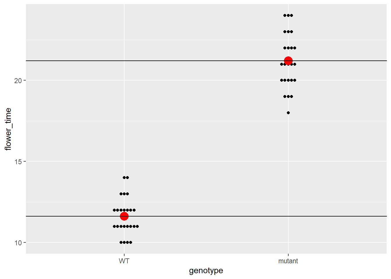
用互作项来完成基因型和环境互作的统计推断
考虑到我们的data数据现在有两个因素,我们就可以像第一部分一样设立一个含有互作项的两因素回归方程了。
\[ Y = \beta_0 + \beta_1 x_1 + \beta_2 x_2 + \beta_3 x_1 x_2 + \epsilon \]
\[ x_1 = \begin{cases} 1 & \text{LD} \\ 0 & \text{SD} \end{cases} \]
\[ x_2 = \begin{cases} 1 & \text{mutant} \\ 0 & \text{WT} \end{cases} \]
首先我们还是先画图:
ggplot(data, aes(x = environment, y = flower_time,
                 color = genotype)) +
  ggbeeswarm::geom_beeswarm(shape = 21) +
  geom_point(shape = 21, color = "black", aes(fill = genotype),
             data = data_summary, size = 5) +
  scale_color_manual(values = c("WT" = "red",
                                "mutant" = "blue")) +
  scale_fill_manual(values = c("WT" = "red",
                                "mutant" = "blue")) -> p

p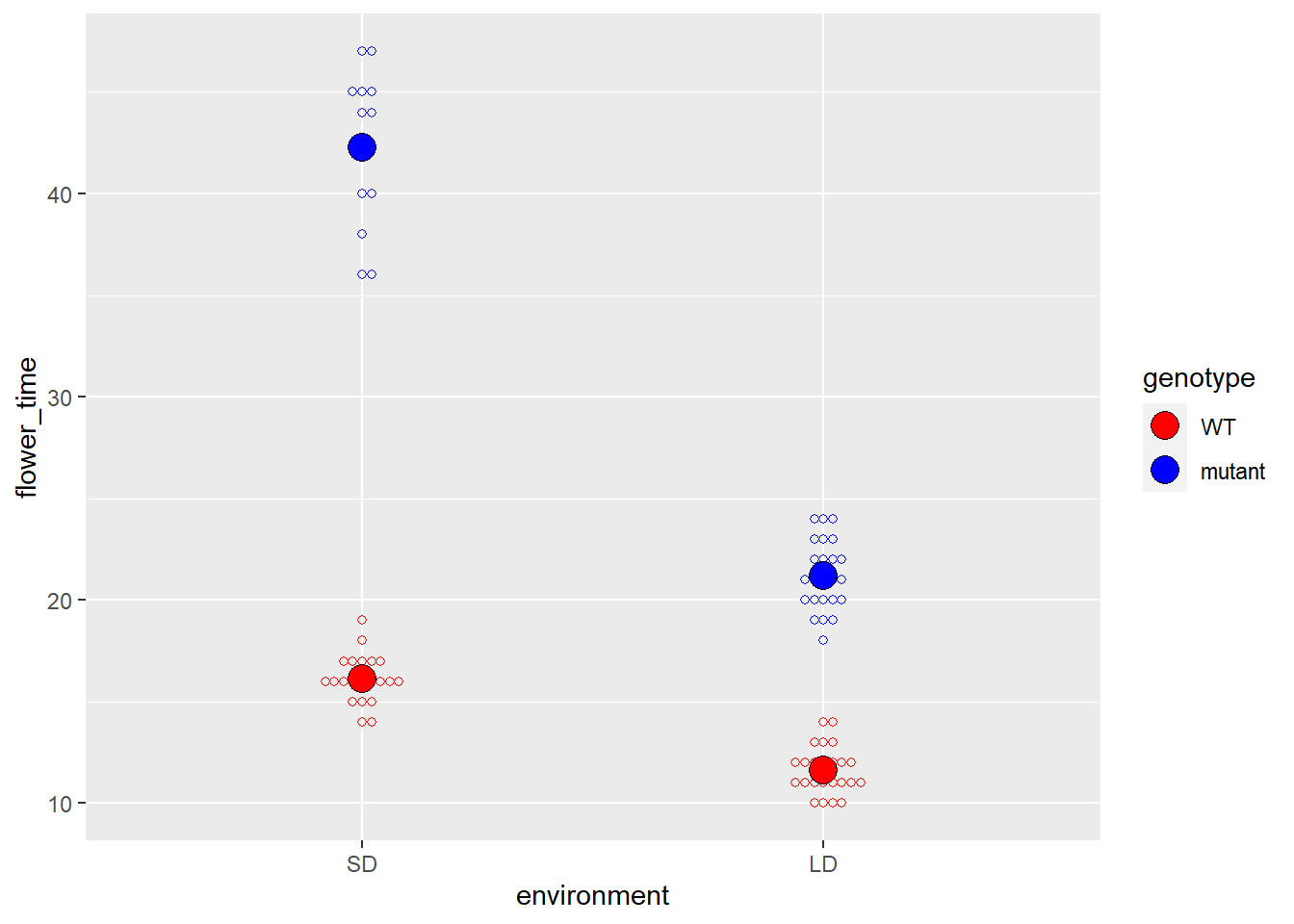
# 我们也可以把对应的基因型在不同的环境中的均值连起来
# 来说明的确存在互作项,即两种环境中开花时间的差异,在不同的基因型中是不一样的
# 可以看到,mutant明显在SD和LD两种环境中开花时间的差异更大
# 这说明就开花时间这个表型而言,mutant是受到光周期影响的
p +
  geom_line(aes(group = genotype), data = data_summary) -> p

p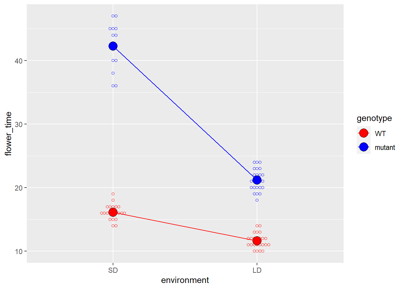
然后再拟合回归曲线:
lm_geno_envir_int <- lm(flower_time ~ environment * genotype, data = data)

(lm_geno_envir_int_summary <- summary(lm_geno_envir_int))
##
## Call:
## lm(formula = flower_time ~ environment * genotype, data = data)
##
## Residuals:
##     Min      1Q  Median      3Q     Max
## -6.2500 -1.1429 -0.1429  0.8571  4.7500
##
## Coefficients:
##                              Estimate Std. Error t value Pr(>|t|)
## (Intercept)                   16.1429     0.4367  36.964  < 2e-16 ***
## environmentLD                 -4.5179     0.5980  -7.555 7.29e-11 ***
## genotypemutant                26.1071     0.7242  36.049  < 2e-16 ***
## environmentLD:genotypemutant -16.5238     0.9264 -17.836  < 2e-16 ***
## ---
## Signif. codes:  0 '***' 0.001 '**' 0.01 '*' 0.05 '.' 0.1 ' ' 1
##
## Residual standard error: 2.001 on 77 degrees of freedom
## Multiple R-squared:  0.9627, Adjusted R-squared:  0.9613
## F-statistic: 663.2 on 3 and 77 DF,  p-value: < 2.2e-16

lm_geno_envir_int_coef <- coef(lm_geno_envir_int)
我们将系数带回到方程中
\[ Y = 16.1428571 + -4.5178571 x_1 + 26.1071429 x_2 + -16.5238095 x_1 x_2 + \epsilon \]
再次的,我们可以根据\(x_1\)和\(x_2\)将这个回归公式拆成四个子公式:
\(x_1\)和\(x_2\)为SD和WT,即0,0:\(Y = 16.1428571 + \epsilon\)
\(x_1\)和\(x_2\)为SD和mutant,即0,1:\(Y = 16.1428571 + 26.1071429+ \epsilon\)
\(x_1\)和\(x_2\)为LD和WT,即1,0:\(Y = 16.1428571 + -4.5178571 + \epsilon\)
\(x_1\)和\(x_2\)为LD和mutant,即1,1:\(Y = 16.1428571 + -4.5178571 + 26.1071429 + -16.5238095 + \epsilon\)
如果我们再次把data_summary拿出来对照的话,我们就会发现这四个子公式刚好就对应着4组均值:
data_summary
## # A tibble: 4 x 3
## # Groups:   environment [2]
##   environment genotype flower_time
##   <fct>       <fct>          <dbl>
## 1 SD          WT              16.1
## 2 SD          mutant          42.2
## 3 LD          WT              11.6
## 4 LD          mutant          21.2
而-16.5238095就是我们这篇文章的目的了,即计算出针对开花这个表型,基因型和环境的关系,并给出一个p-value。
lm_geno_envir_int_summary$coefficients
##                                Estimate Std. Error    t value     Pr(>|t|)
## (Intercept)                   16.142857  0.4367225  36.963652 9.191994e-51
## environmentLD                 -4.517857  0.5980069  -7.554858 7.286087e-11
## genotypemutant                26.107143  0.7242223  36.048523 5.708433e-50
## environmentLD:genotypemutant -16.523810  0.9264282 -17.836038 4.556988e-29

lm_geno_envir_int_summary$coefficients[4, ]
##      Estimate    Std. Error       t value      Pr(>|t|)
## -1.652381e+01  9.264282e-01 -1.783604e+01  4.556988e-29
我们可以在图上面添加注释,来更加直观地解释-16.5238095这个值:
p +
  geom_segment(x = 0.8, xend = 2.2,
               y = as.numeric(data_summary[4, 3]),
               yend = as.numeric(data_summary[4, 3]),
               color = "black",
               linetype = 3) +
  geom_segment(x = 0.8, xend = 2.2,
               y = as.numeric(data_summary[3, 3]),
               yend = as.numeric(data_summary[3, 3]),
               color = "black",
               linetype = 3) +

  geom_segment(x = 1, xend = 1,
               y = as.numeric(data_summary[4, 3]),
               yend = as.numeric(data_summary[2, 3]),
               color = "blue",
               linetype = 3) +

  geom_segment(x = 1, xend = 1,
               y = as.numeric(data_summary[3, 3]),
               yend = as.numeric(data_summary[1, 3]),
               color = "red",
               linetype = 3) +

  geom_segment(x = 0.8, xend = 0.8,
               y = as.numeric(data_summary[4, 3]),
               yend = as.numeric(data_summary[4, 3]) + (as.numeric(data_summary[1, 3]) - as.numeric(data_summary[3, 3])),
               color = "red",
               linetype = 3) +

    geom_segment(x = 0.9, xend = 0.9,
                y = as.numeric(data_summary[2, 3]) + lm_geno_envir_int_coef[4],
               yend = as.numeric(data_summary[2, 3]),
               color = "#17a05d") +
  geom_curve(x = 0.6, xend = 0.89,
             y = 30, yend = 32,
             arrow = arrow(length = unit(0.03, "npc")),
             curvature = -0.5) +
  annotate("text", x = 0.75, y = 30,
           label = paste0("interaction coef:", round(lm_geno_envir_int_coef[4],digits = 2))) +
  theme_bw()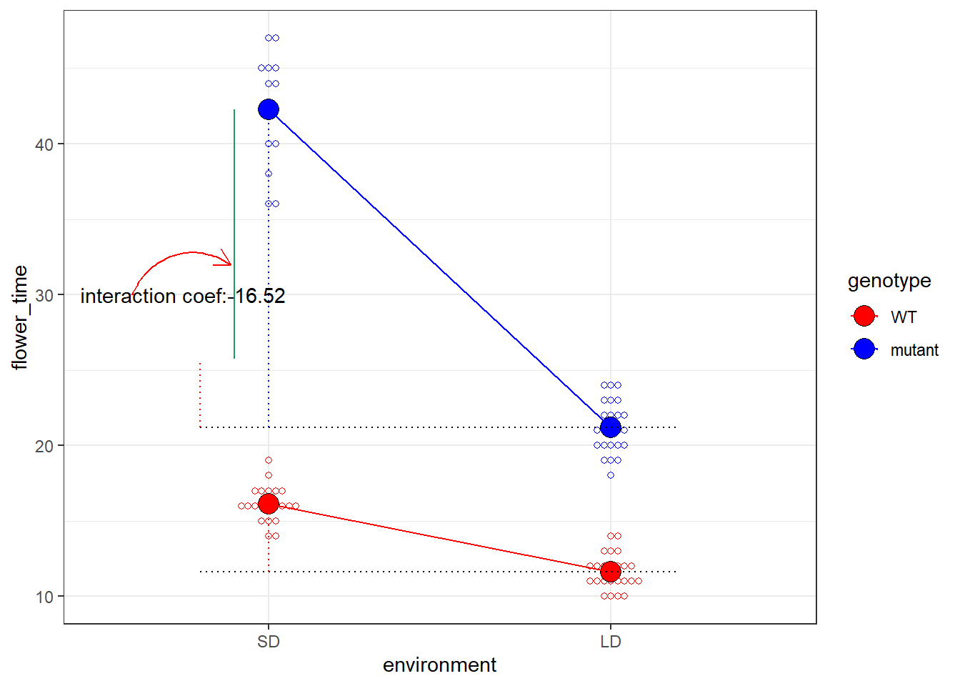
可以看到,通过拟合一个含有互作项的回归曲线,我们顺利地计算出了互作的值,并给出了p-value。顺便提一下,这种含有互作项的思想不仅可以应用在这里,也是做差异分析时候找到在突变体和野生型中,对于环境响应程度不同的基因的基本思想,这一部分我会后面有空的时候讲讲,如何利用DESeq2来找这些基因。
Reference
Guandong Shang
PhD Candidate
My research interests include rstats, epigenomics, bioinformatics and evo-devo.